Dulux Australia. Stylist: Bree Leech. Photographer: Lisa Cohen
It’s no secret that a well-designed home is a happy home and with the wellness movement in full swing, it’s a huge driver of interior trends in 2020.
This winter will see an emphasis on the home as a nurturing retreat from the outside world; a place to warm the soul and lift the spirits, with cocooning colours, luxurious details and comforting curves.
The Indulge palette – one of four trend palettes identified in the 2020 Dulux Colour Forecast ‘Essence’ – combines rich tones of russet and berry with soft shades of lilac and touches of mustard that turn up the heat for winter.
“The Indulge palette is warm and sophisticated, the ideal colour cure for those gloomy winter months,” says Andrea Lucena-Orr, Dulux Colour and Communications Manager. “Deep burgundy, soft violet and accents of coral and mustard feel opulent and exciting, with hints of art deco and 70s disco adding a touch of nostalgia.
“There are different ways to interpret this look – if you’re feeling bold, go dark and dramatic with saturated shades of burgundy and eggplant. Or, for a softer look, opt for soft grey-violet or calico. The key is to choose a hero colour and display it in different shades across your walls and soft furnishings, with one or two contrasting accents to provide that element of surprise. Curved furniture and pared-back styling keep the look fresh and modern.
“This palette is great for revitalising formal areas in period and heritage homes, such as the living room, dining room, hallway and master bedroom. It cleverly blends old and new so you can introduce contemporary flair into your home whilst honouring its history. Add in the crackle of a fire and you’ve created a luxurious winter retreat you’ll love coming home to,” says Andrea.

Dulux Australia. Stylist: Bree Leech. Photographer: Lisa Cohen
To show how easy it is to rejuvenate your home for winter with colour, stylist Bree Leech made over a home office and study nook in a heritage home using the Dulux Indulge palette.
“These two rooms have great bones – high ceilings, ornate cornicing, natural light and a beautiful fireplace in the home office. But the steely grey on the home office walls and the white behind the study nook felt cold and uninviting. Colour has such a huge impact on the mood of a room, and I wanted to create spaces where you’d want to linger,” says Bree.
She adds that give the room’s grand proportions and character, the Indulge palette was a natural choice.
“I chose Dulux Wash & Wear in Russet Tan for the walls and shelving in the home office, which has a luxurious, enveloping feel. Colour contrasts can be incredibly effective when you want to highlight specific features in a room; I retained the existing white ceiling and fireplace, which were painted in Dulux Natural White – a classic warm white, that allowed the cohesion of these elements with the white desk.”
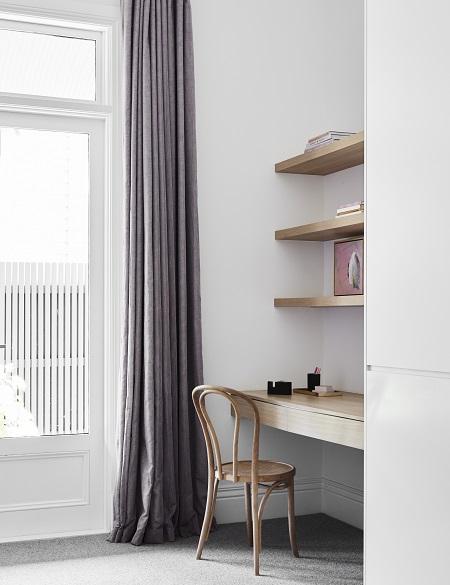
Dulux Australia. Stylist: Bree Leech. Photographer: Lisa Cohen
The study nook in the child’s room, she says, was better suited to a lighter palette. After replacing the cool white on the walls with Dulux Wash & Wear in subtle violet, she gave the chair a quick update in Dulux Aquanamel in Lilac Light.

Dulux Australia. Stylist: Bree Leech. Photographer: Lisa Cohen
“People are often cautious about experimenting with bold colours, but there’s no need to be. Statement colours can be incredibly effective – and chances are, once you start experimenting with them in your home, you’ll never want to go back to a blank canvas,” says Andrea.
“Paint is such a versatile decorating tool – if you change your mind down the track you can easily switch it out.”