Wattyl has launched its colour palettes for 2020 and the two options could not be further apart in terms of style!
‘Bright Future’ and ‘Natural Connection’ are two distinct palettes – the former is vibrant and contemporary while the latter aims to reconnect the home owner to the tranquillity of nature.
Wattyl’s colour and design expert Sarah Stephenson points to digital culture, saying it has made it difficult to distinguish what is real and what is virtual but people don’t seem to mind. At the same time, people yearn to reconnect with the natural environment.
“We are moving forward, whilst looking back, the digital and the natural are so close, and yet worlds apart!”
Wattyl’s two palettes follow this line of thinking.

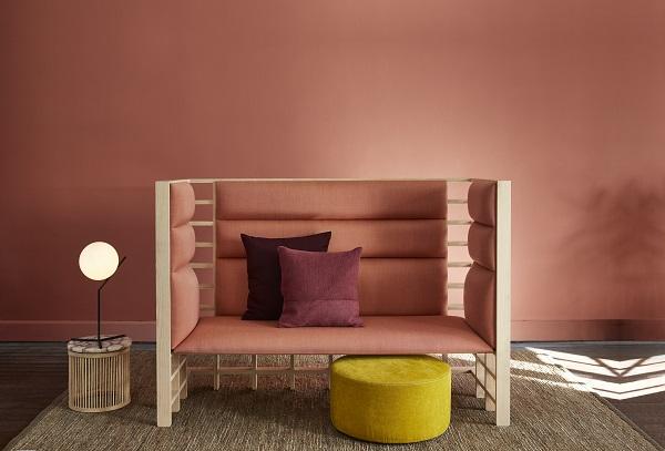
'Bright Future'
Bright Future features saturated colour – bright, deep and bold – to create vibrancy and drama in a space defined by contemporary forms and modern materials. The palette creates a dynamism and vivid intensity when colours are used together or, if used against a backdrop of fresh white the look is more relaxed and playful.
Sarah says: “There is a growing focus on artificial and digital tones that pop on screen as much as they do in real life. The youthful, tech brights of Bright Future create the feeling of an art installation.”
'Natural Connection'.
By contrast, Natural Connection references our desire for the organic and unrefined tones that exist in nature.
This palette of six colours offers earthy, mineral hues, emulating textured surfaces and sustainability, and authentic materials.
“Our homes become sanctuaries with a priority for calm and comfort. The harmony of mid-tone colours creates a calming, cosy environment,” says Sarah.
Wattyl’s range is available nationally at Wattyl Paint Centres and selected Mitre 10 and Home Timber Hardware stores.