Dulux has released its 2019 colour palettes, which have been devised through a prism of wellness, rejuvenation and environmental consciousness. The four palettes each celebrate the individual, acknowledge our past and embrace the natural world, and set the colour spectrums for the coming year.
The palettes are the result of extensive global research undertaken by Dulux colour and communications manager Andrea Lucena-Orr and trend forecaster Bree Leech into influences that are driving current trends across a range of diverse design industries.
“We discuss what is on people’s minds, what factors affect where design and colour is going, and what’s happening from a technical and pigment perspective,” says Andrea.
A range of influences, fed by technology and the information age, a focus on self-care and an increasing social consciousness have informed the resulting palettes.
The overarching theme is titled ‘Filter’, which Andrea says is as a multi-pronged approach to finding the essence of life and favouring the natural and holistic over what is superficial and fleeting.
“This theme highlights the aim to hone in on what is meaningful and to mindfully tune into what we care about. Whether it’s filtering our smart device usage and longer working hours, filtering our consumption of the new and shiny, or simply filtering out the noise of life – we strive to focus on what really matters.”
Overall, the four palettes of the Dulux Colour Forecast 2019 – Legacy, Wholeself, Identity and Repair – present a colour spectrum of globally trending hues with the depth and diversity to create spaces to empower and nurture.
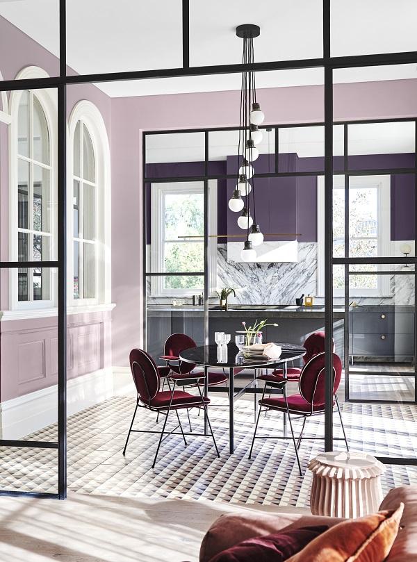
Legacy
Each generation brings with it a new intelligence, taking the best from the past and reinventing it for the present. We are distancing ourselves from damaging consumerist habits, recognising that every action has repercussions – a long-lasting legacy that will be felt for generations to come. Cherished traditions and age-old wisdoms are being adapted to rebuild the present into a better version. This balances rapid innovation and radical creativity with time-honoured skills and old-world charm.
With a focus on craftsmanship and an improvement in traditional skills, classic forms are envisaged and combined in modern and contemporary surroundings. The result is a nod to the elegant past and present, combining eclectic patterns and block colour. The Legacy palette features saturated colour in warm hues of pale pinks, lilacs and mauves, with accents of red, blue and green to punctuate the scheme.
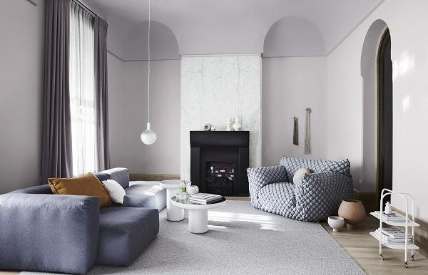
Wholeself
With the ever-present glow of screens, rapid taps and swift swipes of our digital devices, our brains are in overdrive, craving simplicity, silence and a disconnection from screen time. In our search for wellness and ‘wholeself’ we look to clear the mental clutter by making our homes our temple with a calming, distraction-free zone.
With an overwhelming need to pare pack, digitally-detox and mono-task, rather than multi-task in our busy lives, when at home, the Wholeself palette celebrates minimalism through undulating forms. It also details sumptuous texture and block colour of cosy pinks, offset against warm neutrals, golds and mauve-greys.
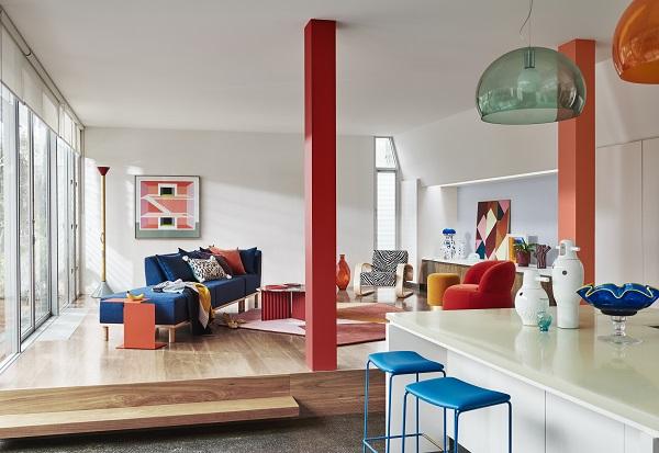
Identity
Welcome to the life of ‘I’, an imaginative frontier inspired by modern multi-cultural influences including sci-fi fantasy and anti-selfie culture, where we turn our backs on social media’s critical gaze looking to only please ourselves. Consequently, we join the brave and confident non-conformists, reject labels that don’t fit, shed our conventional camouflage and take on a more flexible view of the world with fun, spirited energy and spontaneity. Gender is fluid, weird is wonderful and to express yourself is the true path to happiness.
Imperfections are celebrated as unique, and customisation to craft bespoke products is allowing us to express ourselves, rather than settle for someone else’s version. The Identity palette is all about bold experimentation combining block colour, clashing patterns, texture and mixing gloss levels, resulting in an ‘anything goes’ look that is playful, optimistic and youthful. Pale colours are a base for unusual combinations of saturated blue, purple and oranges.
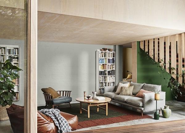
Repair
Our tap-in, tap-out lifestyle allows us to control our destiny, down to the finest detail. This happens from the music we listen to, news we consume, to temperature control and preferred GPS routes. However, the unpredictability of Mother Nature is a reminder that life is fragile – reduced biodiversity and overpopulation casts a shadow over our carefree existence. We are now taking a considered approach to the objects we use, to repair our relationship with nature and the world around us to ensure a positive impact is created.
The Repair palette takes its cues from our need to examine our consumption and waste, favouring vintage, sustainable, repurposed and recyclable products. Comprising neutrals alongside dirty greens, yellow and earthy hues of cinnamon and sienna, Repair’s colours exude warmth and a vintage-feel.