Taking her lead from the Dulux 2020 colour forecast, Henley Design’s Heidi Schwieters has shared her tips and trips for how to plan a paint touch-up before the end of this year.
Warmer whites and tonal blues look set to be the hot trends in paint for the rest of this year as well as grey shades.
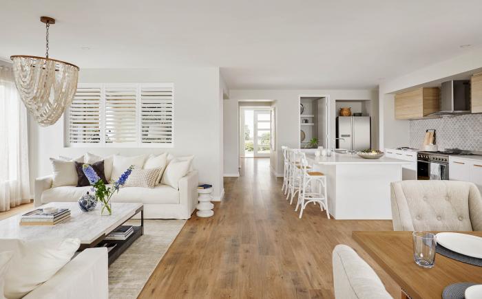
White noise
Whites are always a leader in interiors, regardless of the hot trend on offer. White shades are a perfect backdrop colour to highlight contemporary finishes. They can be used to showcase bold feature pieces of artwork, rugs or cushions incorporating colourful accents or used with a subtle contrast of furnishings with layering of similar tones or materials such as linen, woven fabrics or raw timbers.
Heidi says: “Current trends of white with a warmer tone are seeing a rise, giving a feeling of warmth and comfort from the uncertainly of the outside world, and to complement these warmer whites is an increased use of grounding shades like coffee, stone, dark tans and soft burgundies. These colours give us warm inviting naturalness with a feeling of comfort and richness in earthy accents.”
Singing the blues
“Surprisingly, bolder and soft blues tones have made a revival. Tonal blue colours with accenting rich terracotta shades and subterranean greens, mixed with eclectic vintage and retro inspired pieces and lux materials such as terrazzo create a feeling of comfort in the familiarity and of reminiscent of homeliness. It also enables us to showcase a break from the norm inspiring rejuvenation and creativity.” Heidi adds.
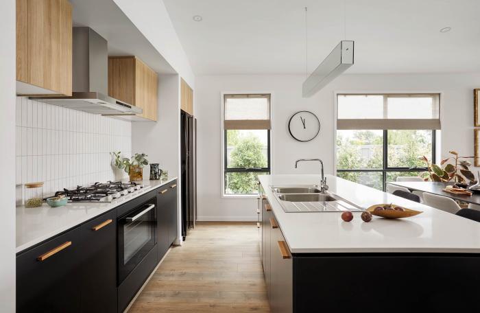
Making it grey
Greys are still represented in selections however the trend is seeing these tones become warmer as per the whites’ trend, steering away from the cooler tones of grey previously more common.
“Use greys with textured feature pieces of pine, rattan, wool and handcrafted raw timber furniture, which are perfect to incorporate neutral tones of beige and blush highlights.”
More than meets the eye
According to Heidi, what denotes a trickier colour can be the undertones of the shade so it is very important to look at colour samples in natural light.
“Colours reflect warmer and cooler undertones and mixing these can be complicated to achieve. Usually it is best to keep one dominant and accent where needed, with paint features or furnishing pieces to cool down or warm up the interior space. Alternatively, keeping consistent with shades all from the warmer or cooler family will avoid issues of the selections not gelling.”
Look around you
Any aspect of the home can be worked to showcase these trickier paint colours as like any colour Scheme it just requires an awareness of the surrounding environment such as quality of light and a consciousness of the vision to what mood is required to be created.
“If ever in doubt, patch tests are always imperative to view shades in the space and if still struggling to decide, come to Henley Design and one of our the Colour Design Consultants will be able to assist.”
Keeping it simple
“These sometimes more difficult paint colours are on trend with a focus on warmth. Creating schemes that emphasise comfort and focusing on ‘raw’ beauty and grounding natural colours of the environment becoming the priority.”